Upon entering the open space of the Anita Rogers Gallery you are greeted with rectangular aluminum canvas’ that immediately draw your eye and are painted like multi-paneled grids. The subtly decadent, organized planes of color and texture serve as visual offsets and underline the surrounding architecture of the Anita Rogers Gallery. Both the rigorous lines of Piet Mondrian’s seminal paintings and the tempered emotive undertones of Agnes Martin’s work come to mind.
Waltemath’s paintings do not assault the space but complement and summarize it. The canvas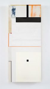 es’ precisely organized colors and textures create a prevailing mood of a restful oasis. The sumptuous dilapidation of the gallery walls and fixtures enhance this mood. On a recent trip to Washington D.C. surrounded by historic monuments and nature I felt the same sense of peace and contemplation. These paintings provide the mental space to think, contemplate, and consider. The rigidly organized lines and colors force the consciousness inward or similarly condense the surrounding space and architecture onto a single plane. As such the paintings are correspondingly simple and complex.
Juxtaposed to the paintings are smaller textile pieces Waltemath considers her “rest” pieces intended to break up the complexity of the paintings and provide an inviting tactility. The soft construct of these pieces provide a nice counterbalance to the paintings and provide a narrative as to how Waltemath may have arrived at her painting techniques. While it is my belief that good painting often deceptively hides the evidence of time, the textile pieces through their meticulously attended stitching, provide not only a rest for the eye but also a welcome relief in the revelation of the lovely preciseness, rigor, and disciplined labor that underpin the paintings on view.
Rather than lines that recede into the paintings at an angle creating the illusion of depth what happens(West 1 1,2,3,5,8…), creates a conceptual understanding of space through horizontal lines. Comparing Waltemath’s paintings in relation to depth, you could say that the amount of uninterrupted open space in what happens(West 1 1,2,3,5,8…), creates a greater depth than Waltemath’s interwoven (East 2 1,2,3,5,8…), which fragments and stratifies its plane. One could say then that these paintings act as windows or looking glasses to greater expanses, however what is depicted is an interior world, both of the viewer and the paintings’ surroundings. Another noteworthy element of the paintings are the specific materials used, graphite, zinc, bronze, lead, that bring to mind layered geological formations or the raw material of industrial spaces. Indeed taking the first analogy, one could analyze her paintings as cross sectional slices of stone compressed and combined with a richness of pure and impure minerals. These windows and geological slices attune the viewer to an interstitial space and perhaps a pataphsycial belief that all will work out as it should.
 The collision and/or communion between repetition and randomness in the visual world is a perpetual source of interest for me. Just as what is regarded as “standard” I think of as being too formally familiar. Dichotomy and conflict create inventive dialectic. There is in this world a ubiquitous visual paradox which is a constant source of creative potential. As Oscar Wilde accurately put it: “The true mystery of the world is the VISIBLE not the INVISIBLE”. I wish to go there for a language. – Gordon Moore
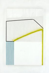 The collision and/or communion between repetition and randomness in the visual world is a perpetual source of interest for me. Just as what is regarded as “standard” I think of as being too formally familiar. Dichotomy and conflict create inventive dialectic. There is in this world a ubiquitous visual paradox which is a constant source of creative potential. As Oscar Wilde accurately put it: “The true mystery of the world is the VISIBLE not the INVISIBLE”. I wish to go there for a language.
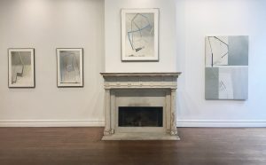 Born in Cherokee, IA, Moore received his undergraduate degree from the University of Washington, Seattle in 1970 and then went on to receive his MFA from Yale University in 1972. He has received numerous awards and grants including the National Endowment for the Arts-Visual Artists Fellowship, the Louis Comfort Tiffany Foundation Award in Painting, the Adolph and Ester Gottlieb Foundation Award in Painting, the Academy Award in Art from the American Academy of Arts and Letters, Pollock Krasner Foundation Grant and the New York Foundation for the Arts Fellowship. Moore’s work can be seen in the collections of the Museum of Fine Arts (Boston, MA), Yale University Art Gallery (CT), Baltimore Museum of Art (MD), General Electric Corporation (OH), the Krannert Art Museum (IL) and Kinkead Pavilion (IL).
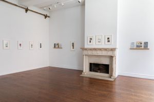
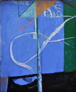 Barlow (b. 1990, Jackson, Mississippi) studied at the New York Studio School with Carole Robb and at the University of Southern Mississippi before receiving his MFA from the Slade School of Fine Art, London. The artist now lives and works in London. Barlow’s large-scale expressive works on linen are evocative explorations of spatial relationships, communication, color, shape and scale. On the recent works included in this exhibition, Barlow writes:
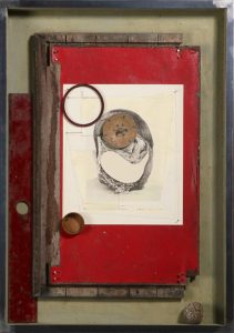 Film & Photography and a Master of Arts Degree from New York University. He studied with Robert Mapplethorpe, Duane Michals and Arnold Newman. Neleman’s collaged works, in the tradition of Joseph Cornell, are put forth in distressed iron frames housing astute composites of old and new, found and created objects addressing sexuality, mortality and identity. On the assemblages, Neleman states: